 On light backgrounds
AffordaCare / Brand library
Brand essentials.
Assets and standards for websites and marketing.
Get the brand assets
01 / Logo library
The signature.
Use the original artwork. Choose the version that gives the logo a clear, confident presence.
Full logos
The complete AffordaCare Insurance signature.

Standalone icons
Original icon artwork, supplied separately from the full logo.



Holiday & awareness logos
Seasonal artwork organized by occasion, with suggested dates for each year.
Show holiday logos & calendarHide holiday logos & calendar
Suggested marketing windows, inclusive of both dates. These are editorial recommendations, not official holiday durations. Dates use the actual U.S. holiday or observance, not substitute office-closure dates. Change the year to recalculate Memorial Day, Labor Day, Thanksgiving, and the Christmas start date.
March / 2026
St. Patrick’s Day
Mar 17, 2026 · March 17
Suggested use / 2026Mar 10 – Mar 17
March 10–17
A short run-up through St. Patrick’s Day.
May / 2026
Memorial Day
May 25, 2026 · Last Monday in May
Suggested use / 2026May 22 – May 25
Friday before Memorial Day through Monday
Use remembrance-focused messaging.
Shared America artworkJune / 2026
Flag Day
Jun 14, 2026 · June 14Suggested use / 2026Jun 12 – Jun 14
June 12–14
Reuse the America artwork for Flag Day.
Shared America artworkJuly / 2026
Independence Day / July 4
Jul 4, 2026 · July 4Suggested use / 2026Jun 28 – Jul 5
June 28–July 5
Includes the holiday weekend when July 4 falls on Saturday.
Shared America artworkSeptember / 2026
Labor Day
Sep 7, 2026 · First Monday in SeptemberSuggested use / 2026Sep 4 – Sep 7
Friday before Labor Day through Monday
Optional patriotic reuse; focus the message on workers.
Shared America artworkOctober / 2026
Breast Cancer Awareness Month
Oct 1–31, 2026 · October 1–31
Suggested use / 2026Oct 1 – Oct 31
October 1–31
An awareness observance, not a holiday. Keep the pink logo on awareness-specific materials all month.
October / 2026
Halloween
Oct 31, 2026 · October 31
November / 2026
Veterans Day
Nov 11, 2026 · November 11Suggested use / 2026Nov 8 – Nov 11
November 8–11
Use appreciation-focused messaging for veterans.
Shared America artworkNovember / 2026
Thanksgiving
Nov 26, 2026 · Fourth Thursday in November
Suggested use / 2026Nov 23 – Nov 29
Thanksgiving-week Monday through Sunday
A focused week of gratitude, ending before the Christmas handoff.
December / 2026
Christmas
Dec 25, 2026 · December 25
Suggested use / 2026Nov 30 – Dec 26
Monday after Thanksgiving through December 26
Begin after the Thanksgiving window and retire the Christmas logo after December 26.
When seasons overlap
October overlaps: use the pink logo for awareness campaigns throughout October. For a single website header, a suggested handoff is pink October 1–23, then Halloween October 24–31. Return to the core logo between seasonal windows.
These dates guide manual use; the site does not automatically replace your brand logo.
Logo usage & source notes
Proposed usage guidance
Give the logo room.
Leave at least half the full logo height clear on every side.
Keep the artwork intact.
Preserve each file’s proportions and colors. Full logos retain the Insurance line and registration symbol. Do not rebuild the wordmark with a font.
Make every detail readable.
Suggested minimum full-logo width: 240px for screens and 2 inches for print. Check the Insurance line and registration symbol at final size. Check standalone icons at their intended display size.
All six official PNG files are preserved unchanged. Use the supplied standalone icons rather than cropping the full logo. A vector master has not been supplied.
02 / Color palette
Color palette.
Slate creates the foundation. Blue draws attention to the next step. Warm neutrals give content room to breathe.
Logo slate and logo gray are sampled from your official artwork. The website slate is the existing wireframe value. HEX / RGB are the digital masters; print color specifications have not been supplied.
Aa
12.09:1White on affordacare slate
Aa
7.25:1White on action blue
Aa
5.85:1White on secondary text
03 / Typography
Typography.
A familiar sans-serif, generous headlines, and an easy reading rhythm. The same type foundation as the website.
Website family
System sans
Apple system sans · Helvetica Neue · Helvetica · Arial
Type scale & interactive specimens
Display96px / 0.94520 weight · -0.045em tracking
Care. Clarity. Confidence.
Section heading64px / 1520 weight · -0.045em tracking
Benefits, made clear.
Editorial heading30px / 1.1520 weight · -0.045em tracking
Built around your people.
Body18px / 1.55400 weight · 0 tracking
Good guidance starts with understanding your business, your people, and what matters to both.
Interface label14px / 1.4650 weight · 0 tracking
Explore your options
Eyebrow12px / 1.2700 weight · 0.12em tracking
EMPLOYER BENEFITS
The existing website uses the operating system’s sans-serif first. Helvetica Neue, Helvetica, and Arial are fallbacks. No custom font files or font licenses were supplied. For presentations and documents, use an available licensed Helvetica Neue, Helvetica, or Arial. Font files are not included in the kit. Sample copy is illustrative.
04 / Space & motion
Space & motion.
A four-pixel base, measured spacing, and subtle motion keep the focus on the content.
Spacing, radius & motion specifications
4px
0.25rem8px
0.5rem12px
0.75rem16px
1rem24px
1.5rem32px
2rem48px
3rem64px
4rem96px
6rem144px
9remMaximum canvas1,440px
Readable copy680px
Responsive gutters24–72px
Section rhythm96–176px
0px
Editorial panels12px
Images & framed content999px
Buttons & controlsInteraction180ms
Hover, focus, and button transitions.
Entrance reveal680ms
A gentle rise into place in the wireframe.
Reduced motion
Always respected.
Remove transforms, entrance animations, and smooth scrolling.
05 / Components
Components.
Reusable patterns from the website, with practical examples for the next page you create.
Marketing materials · Flyer layout & print reference
Shared composition patterns; use AffordaCare assets and colors for AffordaCare, and CHAMP assets and colors only for CHAMP materials.
One clear idea.
A confident next step.
Bold hierarchy. Quiet background detail.
One clear idea.
A confident next step.
Bold hierarchy. Quiet background detail.
Illustrative composition with supplied standalone icons. Sample copy is not a product claim.
Solid-color backdrops & oversized icons
In the flyer: Full-width slate or navy header, with a large single-color brand icon cropped at the right edge and rendered faintly behind white text.
Use the supplied standalone icon, never a crop of the full logo. Keep the primary logo intact and separate. Scale the decorative icon proportionally, clip it within the backdrop, and start at 6–10% white opacity. Keep fine detail away from text; hide decorative images from assistive technology. This cropping treatment applies only to the decorative icon.
Bold hierarchy, selective emphasis
In the flyer: Helvetica Neue Bold headlines at 42 pt with 49 pt baseline spacing. Arial supplies body copy; Arial Bold emphasizes benefit names, table labels and figures. Arial Black appears in short statistics and badges.
Use short, sentence-case headlines with deliberate line breaks. Pair a bold benefit name with a regular-weight explanation. Keep all-caps and extra-heavy weights for short labels. This is a print reference pairing; retain the guide’s Heebo web family for CHAMP and Americana exclusively for the logo.
Four-column highlights
In the flyer: The front has one continuous four-column strip. The back has four 120 × 76 pt cards with 20 pt gaps and 3 pt colored top rules. Both start at 286 pt, overlapping the 317 pt header edge by 31 pt.
Align the strip to the body grid. Give each card one prominent value and a short label; use color as an accent, not the only identifier. On narrow screens move to two columns or one, and remove overlap if labels wrap. Use arithmetic connectors only when the underlying figures genuinely add up.
Comfortable margins & repeatable spacing
In the flyer: Both sides share 36 pt (½-inch) left/right margins and a 540 pt content width. The front table uses a 40 pt header, 44 pt rows and 3 pt edge accents. Back-page list accents are 3 × 12 pt.
Align logo, heading, cards, body and disclaimer to a common grid. Start with 12–16 pt card padding and 12–24 pt section gaps in print; use 16–24 px card padding and 24–40 px section gaps digitally. These padding/gap ranges are recommendations, not measured universal rules. Keep content inside trim-safe margins; confirm any bleed with the printer.
Disclaimers that remain readable
In the flyer: Arial 8 pt, regular, with 10 pt line spacing, in muted slate on white. The footer spans the same 540 pt content width and occupies four or five lines.
For similar Letter flyers, start at 8–9 pt with 10–12 pt line spacing; enlarge or reflow if the actual-size proof is hard to read. For web, use 14–16 px and 1.4–1.5 line height instead of shrinking print text. Keep qualifications visible beside or below the relevant claim, with contrast and no decorative art behind them. Size is a design reference, not a determination of legal sufficiency.
Tables, benefit lists & supporting imagery
In the flyer: The front pairs a dark table header with alternating light rows. The back uses bold benefit lead-ins and small blue bars, with a badge and Champy in a separate right-hand column.
Use concise column labels and consistent numeric alignment. Repeat labels when tables stack on mobile. Keep the mascot in its own space without covering copy, footnotes or the main logo. Carry forward the layout only: plan rates, savings, eligibility and coverage statements from this flyer are not evergreen brand text.
Measured type sizes & digital adaptations
Measured from the supplied two-page US Letter flyer (612 × 792 pt). Print values describe this reference, not mandatory sizes for every format. Digital values and opacity ranges are recommended starting points.
| Use / flyer family | Observed print | Suggested digital |
|---|---|---|
| Hero headlineHelvetica Neue Bold | 42 pt / 49 pt leading | 32–56 px / 1.1–1.2 |
| Section headingHelvetica Neue Bold | 25 pt | 24–32 px / 1.2 |
| Intro / benefit copyArial; bold lead-ins | 12–12.5 pt | 16–18 px / 1.4–1.5 |
| Table body / labelsArial / Arial Bold | 8.5–11 pt | 14–16 px / 1.4 |
| DisclaimersArial regular | 8 pt / 10 pt leading | 14–16 px / 1.4–1.5 |
Source: CHAMP-and-Major-Medical-Front-and-Back.pdf · Both pages inspected September 15, 2026. Measurements are in points at the original 8½ × 11-inch size. The current brand palettes and original logo files remain authoritative.
Download marketing reference ↓Buttons, forms & page patterns
Buttons & links
52px height · pill radius · 180ms transitionButton clicks demonstrate states. The text link opens the interior wireframe. Replace the copied destination with your actual contact page; the button style comes from the website stylesheet.
Form fields
Example onlyThis specimen does not submit or save information.
Expandable information
Keyboard accessibleWhen should I use an accordion?
For optional supporting details that people can explore in their own time.
What should stay visible?
Keep the main message, next action, and essential qualifications outside an accordion.
06 / Brand voice
Brand voice.
Keep the language as clear and considered as the design. Start with what the reader needs to understand.
Required for AffordaCare and Champion Health (CHAMP)
Additional proposed voice & usage guidanceClear, not cute.
All text must be clear and easy to understand. Headlines and body copy must communicate the message directly. Never use cute phrasing, puns, wordplay, or clever metaphors to illustrate a message. Use plain, specific language so readers understand the meaning without having to interpret it.
Applies to all headlines, body text, buttons, captions, disclaimers, app copy, and marketing materials for both brands.
Use: Understand your health benefits.
Avoid: Give your benefits a healthy glow.
01
Clear.
explain the next step in everyday language.
02
Considered.
lead with the employer’s needs and relevant context.
03
Human.
speak to people, not policy numbers.
Brand name
Preserve the capital A and C.
Full name
Use when introducing the organization.
Writing example & claims guidance
Illustrative copy
Let’s find a benefits strategy that fits your business and your people.
Direct, conversational, and grounded in the reader’s needs.Product terms, savings figures, testimonials, contact details, and legal copy must come from current approved business materials. The wireframe is not a source of verified claims.
07 / Downloads
Downloads.
Original artwork, reusable values, and practical guidance for the next website, presentation, or campaign.
Main logos & icons
Download ZIP AffordaCare brand kit
3 official logos · 3 official icons · Original PNG files + fonts & colors PDF
Master data & provenance
One source, consistent outputs.
The AffordaCare website and brand kit share the same master color and font values. Champion Health has its own separate section and downloads, used only for materials that include CHAMP products.
Implementation reference
Edit brand/system.json to update the foundation. The build generates /brand-guide/brand/tokens.css, /brand-guide/brand/tokens.json, the guide, and the ZIP. The CSS exposes --ac-* properties. Existing website components retain their original styles.
Official
6 logo and icon files supplied by AffordaCare. Holiday artwork is stored in its own category.
From the wireframeWebsite colors, font stack, layout dimensions, and motion values.
ProposedLogo spacing and minimum size, brand voice, responsive type specimens, and form treatments.
Product brand / CHAMP
Champion Health.
A dedicated brand resource for landing pages and marketing materials featuring CHAMP products.
CHAMP products only
A separate brand, with a defined purpose.
Only landing pages and marketing materials that include CHAMP products. AffordaCare remains the default for the website and all other materials.
CHAMP colors, typography, and assets are kept in their own master data and downloads.
 Original full-color signature
The CHAMP palette.
Current CHAMP digital palette, taken from the updated Champion Health page. Original artwork colors remain unchanged and are listed separately. No approved print conversions are supplied. Select a swatch to copy its HEX value.
Use #EEF1F8 or #AAB3C9 on the dark surfaces. Use #080C1C on the light action gradient. Subtle #252C46 borders are decorative; inputs need a stronger #435073 boundary and visible focus.
CHAMP digital style
Understand your health benefits.
Clear information to help you compare your options and take the next step.
View style specifications ↗Pill buttons with dark text; hover to #EEF1F8.
linear-gradient(100deg, #C2A4F2, #8EC9EF)Short, large headline accents only; keep body text solid.
linear-gradient(100deg, #CFA6F5, #8FC4F2, #7FE0EA)Selected trust-section headings.
linear-gradient(97deg, #CFA6F5, #B0AEF6 32%, #8FC4F2 62%, #7FE0EA)Subtle dark cards with a #252C46 border.
linear-gradient(145deg, #11162B, #0A0E1F)Original artwork paletteUnchanged · Logo colors
Champion blue
#2490E9Champion navy
#21285DFlame gold
#FDCA4AFlame red
#DE4949White
#FFFFFFThese colors remain part of the supplied original artwork. Do not recolor logos or torch icons to match the digital palette.
Typography & creative reference
Logo font · Logo use only
Americana Extra Bold - BOLD
Americana Extra Bold – BOLD is used only in the CHAMP logo. The original OTF is supplied for logo work; use the finished logo assets in layouts. Do not use Americana for headings, body text, or app interface text.
The supporting web families follow the updated Champion Health page.
Website supporting family · HeeboUnderstand your
Understand your
health benefits.
Use Heebo for readable product content and supporting messages.
Illustrative specimen · Heebo 700 / 400Heebo
Primary headings, body, navigation and controls
Observed weights: 400, 600, 700
View font on Google Fonts ↗Plus Jakarta Sans
Trust-section headings and large statistics
Observed weights: 600, 700, 800
View font on Google Fonts ↗Inter
Trust-section supporting paragraphs
Observed weights: 400, 600, 700
View font on Google Fonts ↗Website type reference.9 styles · Expand sizes & notes
Current page CSS, checked against rendered desktop typography. Fluid sizes use viewport width; compact layout begins at 800px, with additional adjustments at 600px and 520px. These are CHAMP-only references, not AffordaCare defaults.
| Use / family / weight | Desktop | Tablet | Mobile |
|---|---|---|---|
| Hero headlineHeebo · 700Line height 1.02; tracking −0.04em. Let long text wrap. | clamp(52px, 6.5vw, 96px) | Same fluid rule | 49px at ≤520px |
| Hero accentHeebo · 700Line height 1.18; short gradient emphasis. | 0.62 × hero size | 0.62 × hero size | 30.38px at ≤520px |
| Section headingHeebo · 700Line height 1.12; tracking −0.035em. | clamp(34px, 4.5vw, 62px) | Same fluid rule | 34–36px |
| Card headingHeebo · 700Line height 1.25; enrollment cards use 19px. | 21–23px | 21–23px | 21–23px |
| Body / introductionHeebo · 400Line height 1.6. Benefit-card copy is 15px / 1.5; standard card copy 16px / 1.6. | 18px / 20px | 18px / 20px | 18px / 20px |
| Buttons / labelsHeebo · 600–700Buttons 700; eyebrow labels uppercase with 0.16em tracking. Main action 16px; compact action 14px. | 14–16px / 11px | 14–16px / 11px | 14–16px / 11px |
| Trust headingPlus Jakarta Sans · 700Line height 1.15; gradient text. | clamp(32px, 4.2vw, 58px) | Same fluid rule | 32–34px |
| Trust statisticPlus Jakarta Sans · 800Line height 1.08; white numerals. Inter supporting copy 14–20px / 1.5. | clamp(44px, 6.5vw, 84px) | Same fluid rule | 54px at ≤600px |
| DisclosuresHeebo · 400Reference observation, not a required minimum. For new materials use 14–16px digital disclosures with 1.4–1.5 leading; keep essential qualifications visible. | 11–13px observed | 11–13px observed | 11–13px observed |
Source styles: reference page · published page styles. Heebo, Plus Jakarta Sans and Inter load through Google Fonts, with Arial as fallback.
Creative reference · CHAMP only
Structure with a clear next step.
Current CHAMP digital direction, adopted from the updated Champion Health page on September 26, 2026.
- Use near-black and deep-blue section bands, off-white headlines, and muted blue-gray body text.
- Use lavender-to-sky pill actions and limited lavender-to-cyan headline emphasis. Keep paragraphs solid-color.
- Pair bold headings with compact two- or three-column cards. Use five columns for short process steps on wide screens; preserve readable widths on smaller screens.
- Use subtle gradients, 1px borders, rounded panels and restrained blue line icons. Keep logos and original artwork unchanged.
- Pair interactive examples with a clear explanation and visible qualifications. Keep optional supporting details collapsible.
Use Heebo for primary copy; reserve Plus Jakarta Sans and Inter for trust modules. The earlier flyer remains a print composition reference, not the current digital palette or heading-weight standard. Clear, not cute remains required.
Explore the CHAMP Plan reference ↗Spacing, components & interaction
clamp(24px, 5vw, 72px)
88px vertical desktop; 60px at ≤800px
30px standard; 20px 24px benefit cards; 20px 16px process cards
20px cards; 14px process steps; 24px compact calculator
16px
20px
8px
999px
16px 26px primary; 12px 18px compact
Two- and three-column cards stack at ≤800px. Calculators stack at ≤600px. Process steps use a contained horizontal scroller on smaller screens; never cause page-level horizontal scrolling.
3px solid #8EC9EF, offset 5px. Keep keyboard focus visible.
Subtle 0.22–0.25s hover transitions. Disable decorative loops and transforms when reduced motion is requested. Pause moving trust content on hover and focus.
Simple blue line icons at roughly 30px; use supplied original logo and torch artwork for brand marks. Do not recolor logos to match the new gradients.
Clear, not cute. All CHAMP text must communicate directly and be easy to understand. Never use cute phrasing or wordplay to illustrate a message. View the shared writing standard ↗
Earlier flyer reference: print composition, spacing & disclaimers ↗
Original logos & torch icons.
All 14 supplied PNGs, preserved unchanged. Expand a collection to preview and download individual files. White artwork is shown on a contrasting surface.
Full logos7 originals · Expand / collapse






Torch icons7 originals · Expand / collapse







Preserve proportions, colors, and lettering. Use the supplied torch icons instead of cropping a full logo. No vector masters are supplied. The supplied Americana font is included for logo use only.

CHAMP mascot
Meet Champy.
Champy is the Champion Health mascot used in CHAMP marketing materials and the CHAMP app.
Use for CHAMP-related materials and app experiences only. Champy is not the AffordaCare website mascot.
Champy character library18 originals · Expand / collapse
Core poses



Expressions







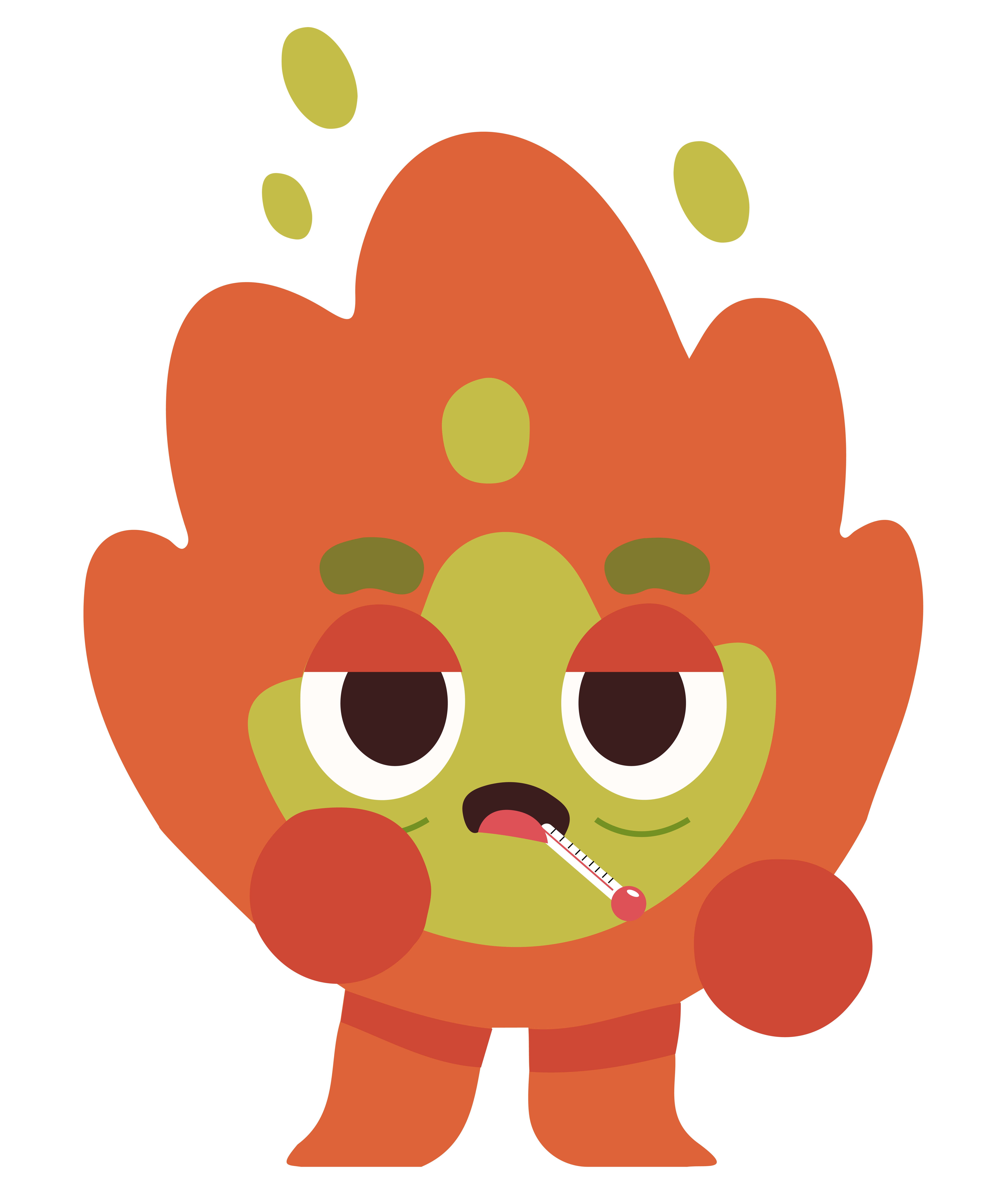






Suggested usage: Preserve the supplied artwork, proportions, expressions, and colors. Choose a pose that fits the message and keep the character clear of text and controls. All 18 supplied PNG files are preserved unchanged and available individually above.
Main logos & icons
Download ZIP ↓Download CHAMP assets.
7 logos · 7 torch icons · Original PNG files + fonts & colors PDF
Using CHAMP on a product page
Import the CHAMP token file and add data-brand="champ" to the CHAMP product container. Apply its --champ-* values explicitly. These tokens never redefine AffordaCare’s --ac-* values or global website styles. CHAMP data lives separately in brand/champ.json and is excluded from the AffordaCare kit.
CHAMP kit v1.4.0 · Updated September 26, 2026